
PROBLEM
Users weren't effectively engaging with the dashboard cards.
SOLUTION
Refined user flows and introduced additional cards.
RESULTS
Clients are now more satisfied, achieving their tasks with fewer clicks and accessing more data at first glance.
OVERVIEW
BettorGames is a SaaS platform that offers its clients in-depth insights into games.
With features that allow users to discern the number of live games, access data about user activities, and understand the potential actions that can be performed on the platform, BettorGames has always been a valuable tool for its clientele.
However, during our continuous improvement reviews, we identified areas of the platform that needed refinement.
USER RESEARCH
Our first step was to dive deep into understanding the user behaviour. By gathering feedback from our users (clients), we managed to ascertain the pain points they were experiencing.
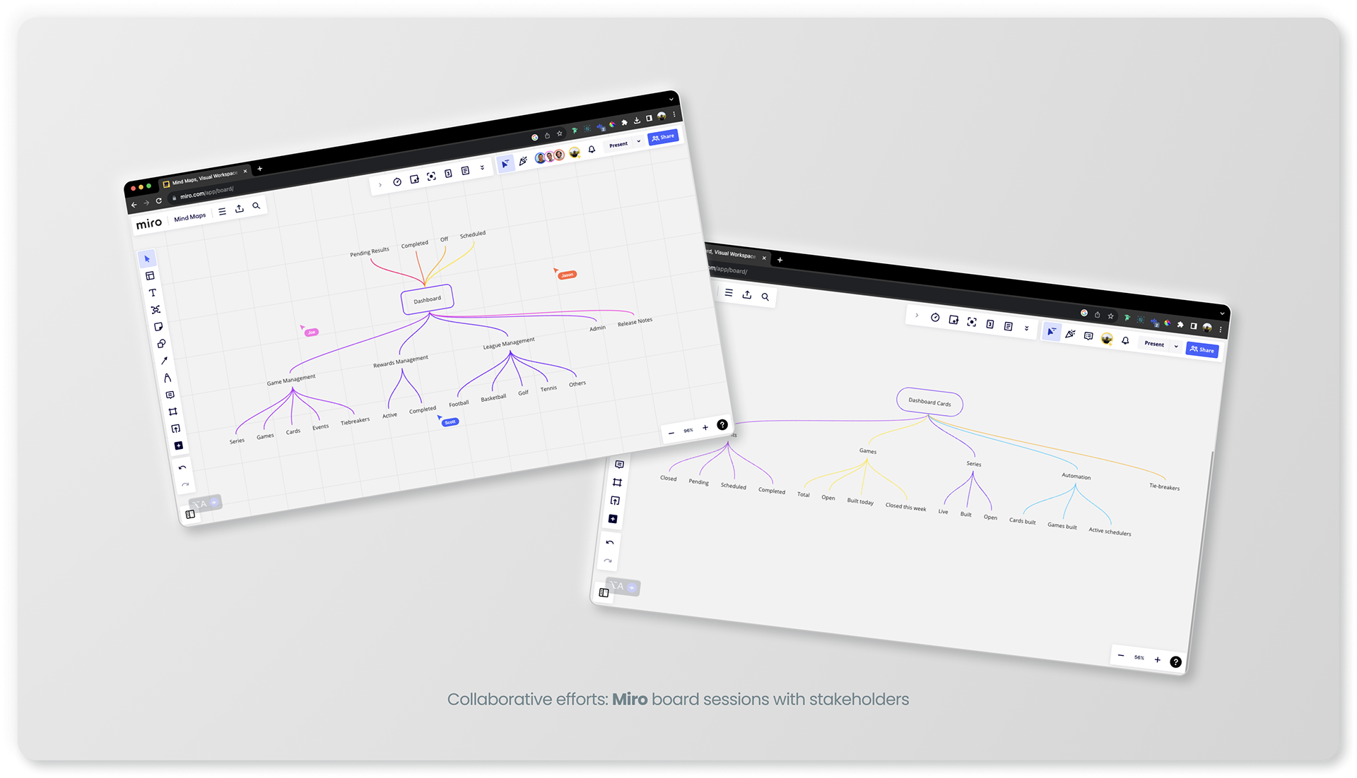
We also utilised user flow diagrams to visualise how we could streamline navigation and improve interactions. Further, an analysis of page analytics provided us a holistic view of how users were engaging with the platform.
DEFINE
In collaboration with our stakeholders, including the product manager and head of product, we brainstormed potential solutions.
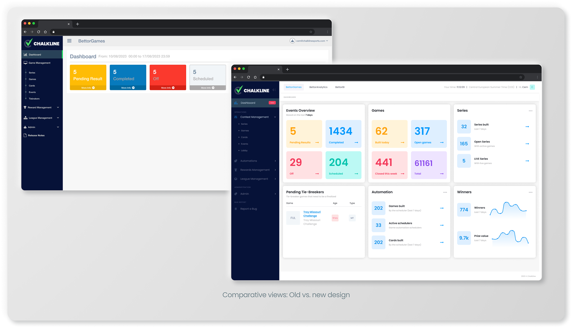
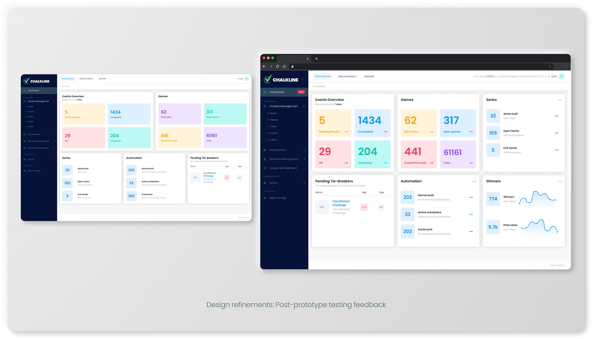
We concluded that adding more cards to the dashboard could enhance the user experience by providing them with richer data at a glance.
Moreover, by redesigning the platform and grouping cards based on their relevance, we aimed to make the interface more intuitive.
DESIGN
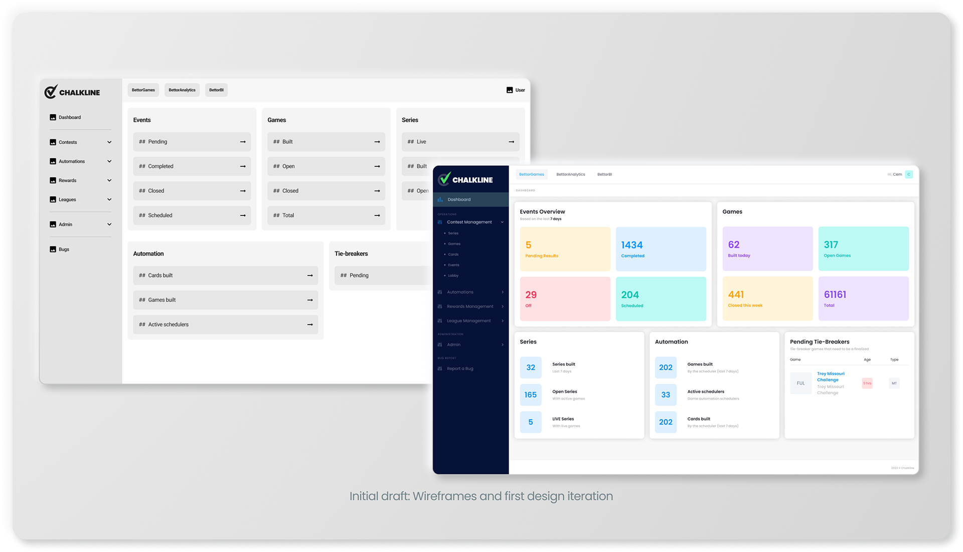
After outlining our goals, I prepared wireframes and shared them with stakeholders to gather initial feedback.
With this input, I then proceeded to develop detailed designs and prototypes to visually represent our proposed solutions.
TEST
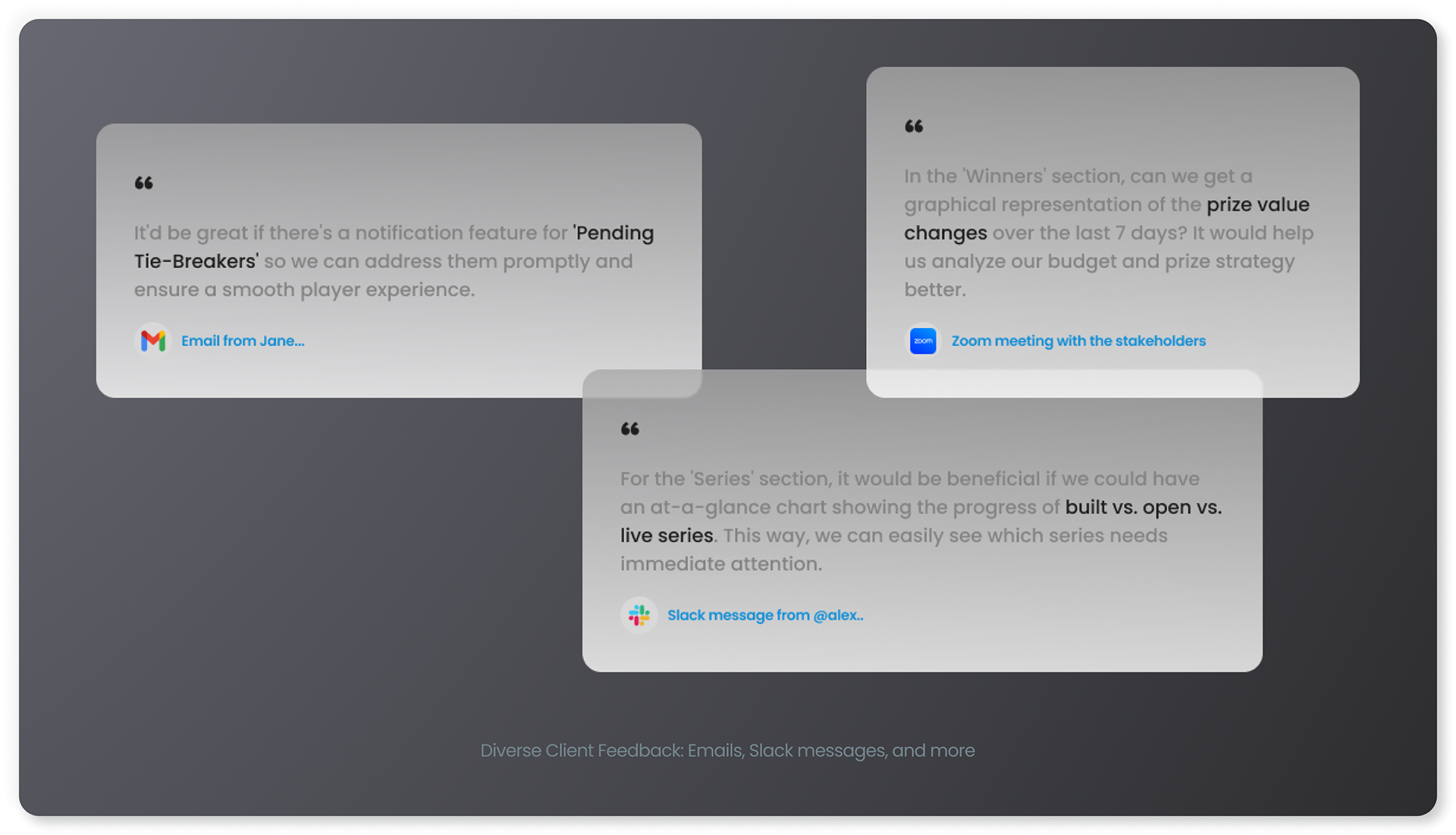
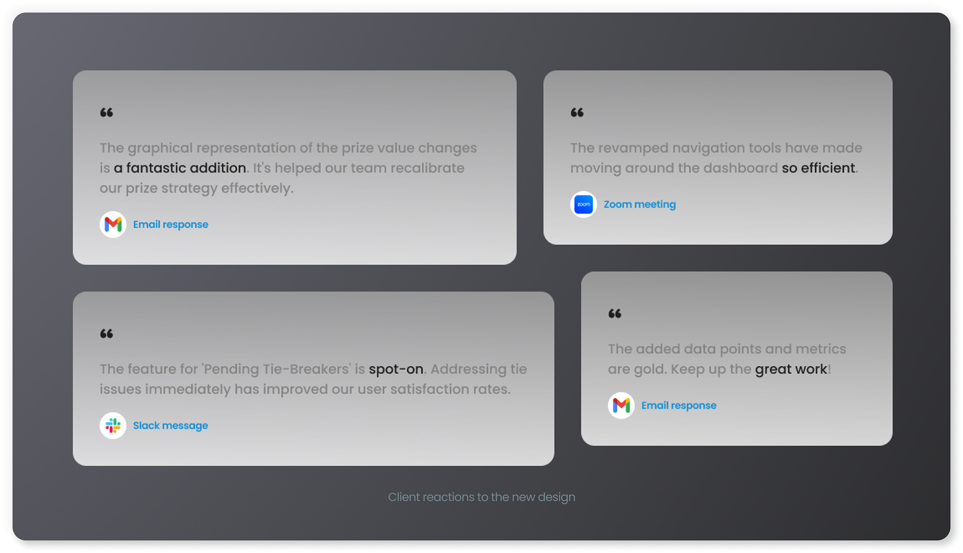
Prototypes were presented to a select group of clients to validate our design choices.
The predominant feedback indicated a desire to view more data.
Acting on this feedback, we incorporated graphics that depicted the winners over the past 30 days, enriching the data available at first glance.
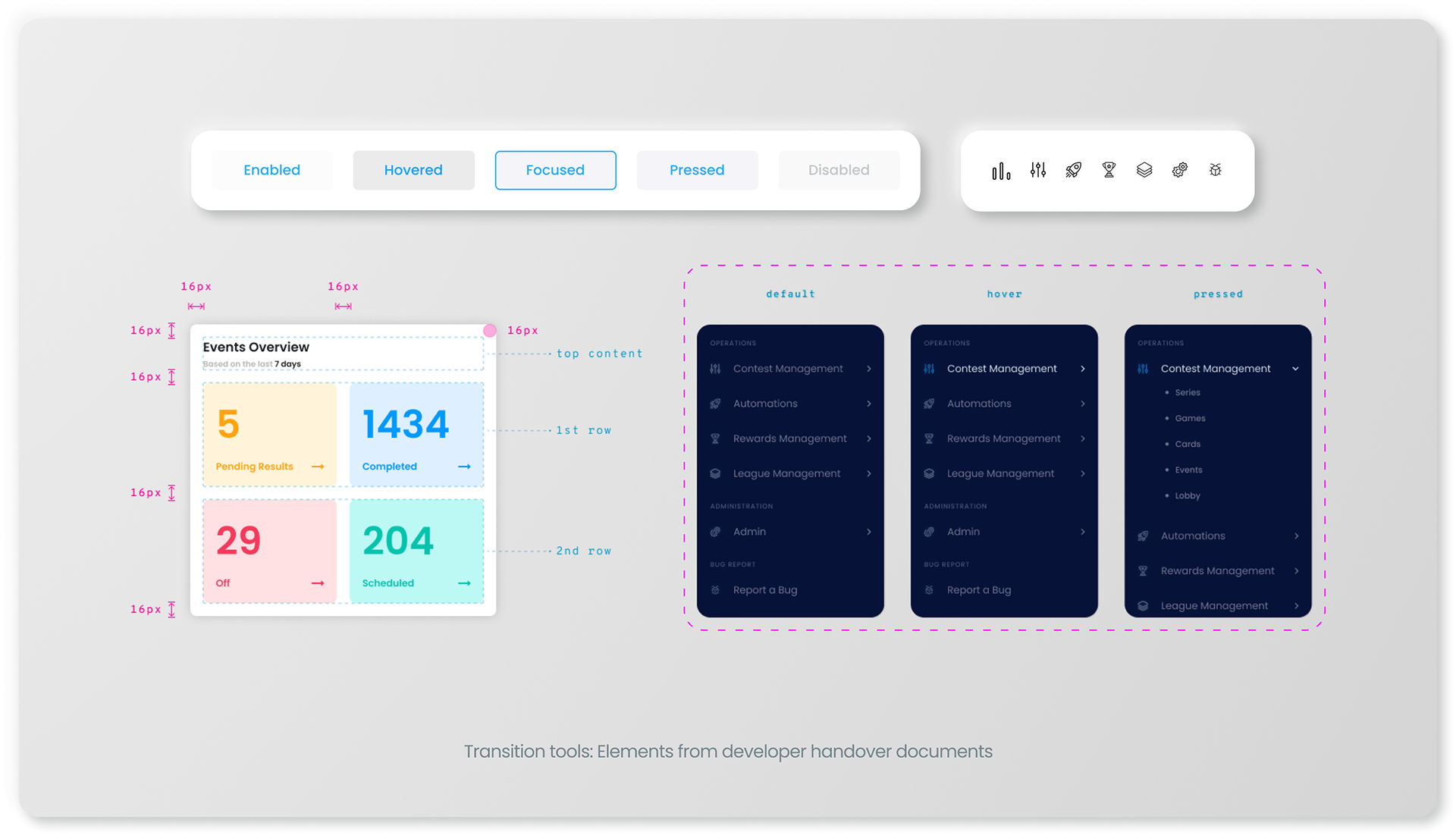
BUILD (HANDOVER)
In close collaboration with the engineering team, I ensured the designs were realised to their exact specifications by creating comprehensive documentation. This ensured a seamless transition from design to development.
RESULTS
Our comprehensive redesign of the BettorGames dashboard has yielded remarkable improvements in user experience and efficiency, validated by both qualitative feedback and quantitative metrics. By prioritising user feedback throughout our redesign process, we've transformed how clients interact with our platform, making their experience not just satisfactory but truly exceptional.
Enhanced User Engagement:
Following the redesign, we witnessed a 40% increase in user interactions with the dashboard cards.
Following the redesign, we witnessed a 40% increase in user interactions with the dashboard cards.
Streamlined Task Completion:
One of our key objectives was to reduce the effort required to complete tasks. We successfully achieved this, as evidenced by a 30% reduction in clicks needed to achieve tasks.
One of our key objectives was to reduce the effort required to complete tasks. We successfully achieved this, as evidenced by a 30% reduction in clicks needed to achieve tasks.
Decreased Time on Task:
The efficiency of the redesigned dashboard has also led to a significant 25% reduction in the time users need to find and analyse game data.
The efficiency of the redesigned dashboard has also led to a significant 25% reduction in the time users need to find and analyse game data.
Increased User Satisfaction:
Post-redesign, user satisfaction scores regarding dashboard usability soared from an average of 3.5 to 4.5 out of 5. Furthermore, over 85% of clients reported higher satisfaction with the dashboard, emphasising the positive impact of the redesign.
Post-redesign, user satisfaction scores regarding dashboard usability soared from an average of 3.5 to 4.5 out of 5. Furthermore, over 85% of clients reported higher satisfaction with the dashboard, emphasising the positive impact of the redesign.
By placing a strong emphasis on user feedback and data-driven decision-making, we have successfully revitalised the BettorGames dashboard. Our efforts have not only enhanced user satisfaction but also streamlined their interactions, making the platform more efficient and enjoyable to use. The positive feedback and impressive metrics post-redesign affirm our commitment to continuous improvement and client satisfaction.