Approach
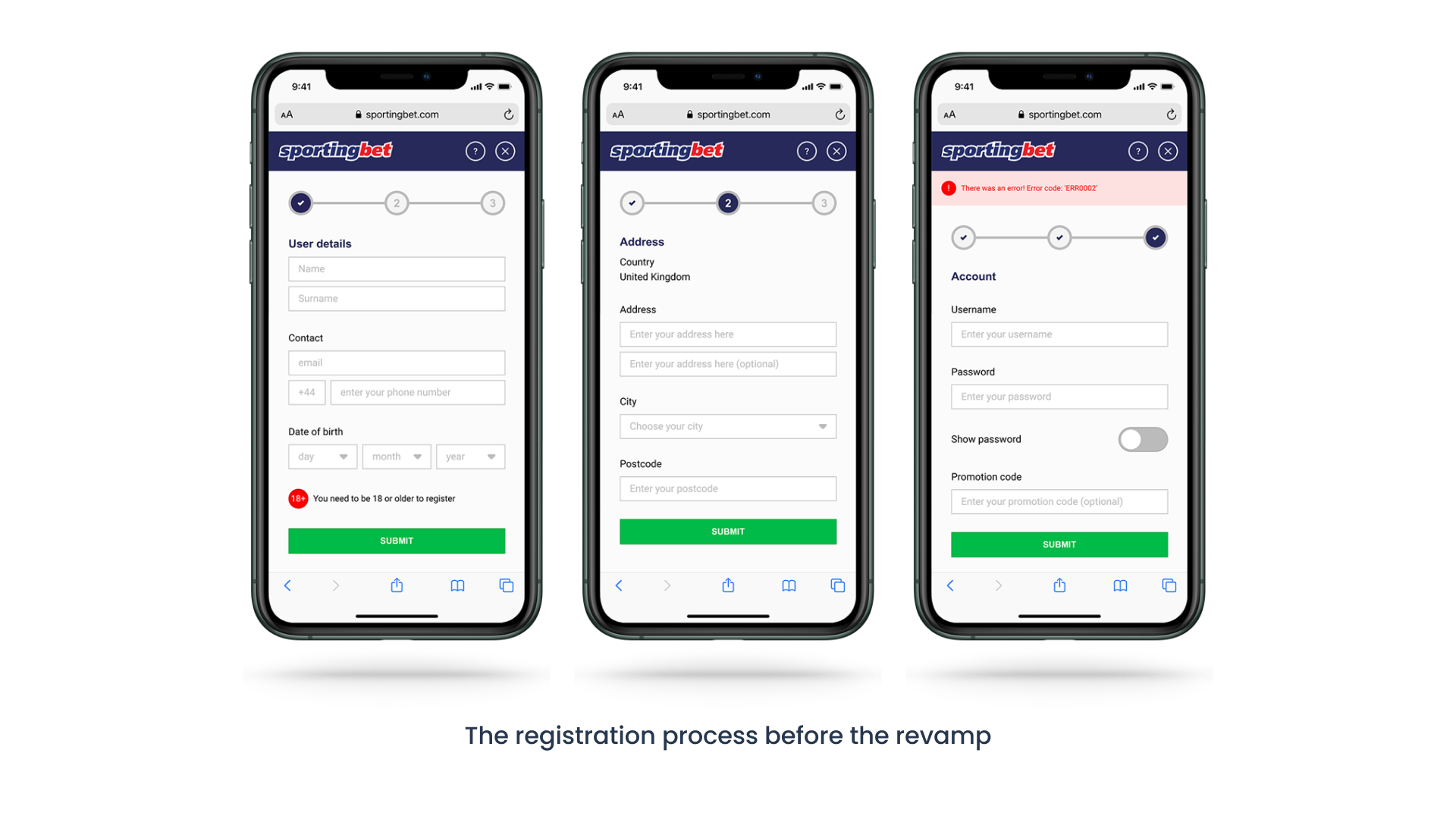
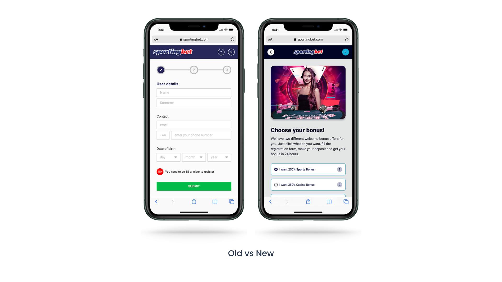
Through careful analysis and research, I developed a new approach to the registration flow. The new registration flow included the following solutions:
1. Displaying bonus campaigns to attract users and encourage them to complete registration.
2. Making the form steps more clear and error codes more concise to guide users to input the correct data.
3. Connecting the form to the deposit flow and advertising the benefits of depositing immediately.
Research
Competitive analysis
To understand user behaviours and habits, I conducted a competitive analysis of 14 different iGaming competitors operating in the same territory. This analysis helped me to identify gaps in the market and create a design concept that would set our product apart from the competition.
Interviews
The product had access to a pool of over 30,000 active users. I worked with the customer support team to recruit interviewees who represented a diverse range of user types and behaviours.
Through a series of user interviews, I gathered valuable feedback about the existing product and insights into user behaviours on both similar and dissimilar platforms.
This information informed the design of a stronger registration journey that would guide new visitors to become users easily and encourage them to follow through with the deposit flow.
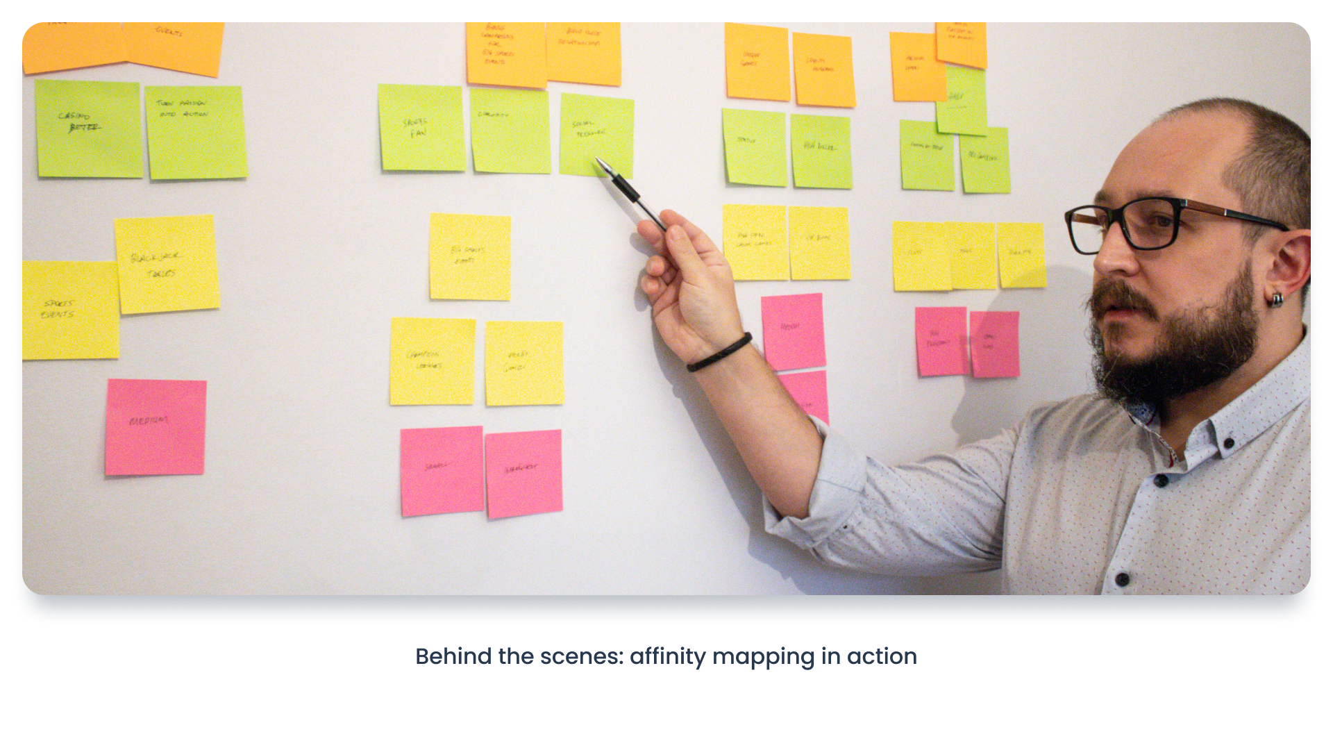
Affinity mapping
I arranged an affinity map workshop session with other stakeholders to discuss user needs and create ideas for possible user journeys. This workshop helped me to understand the backend needs of the project and gave me a clear vision to start the task.
User research findings
The research process helped me to understand our visitors and potential new users' behaviours and identify missing or inadequate communications in our existing registration journey.
Analysis
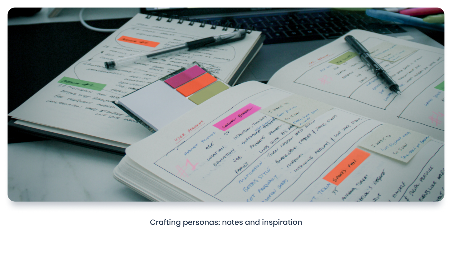
User Personas
With the help of the customer support team, I created four different personas that helped me to shape the different variations of the registration flow.
User stories
Based on the personas, I created different user stories that helped me to empathise with the target audience and understand their needs better. These stories also helped me to convince different stakeholders to accept the new design proposal.
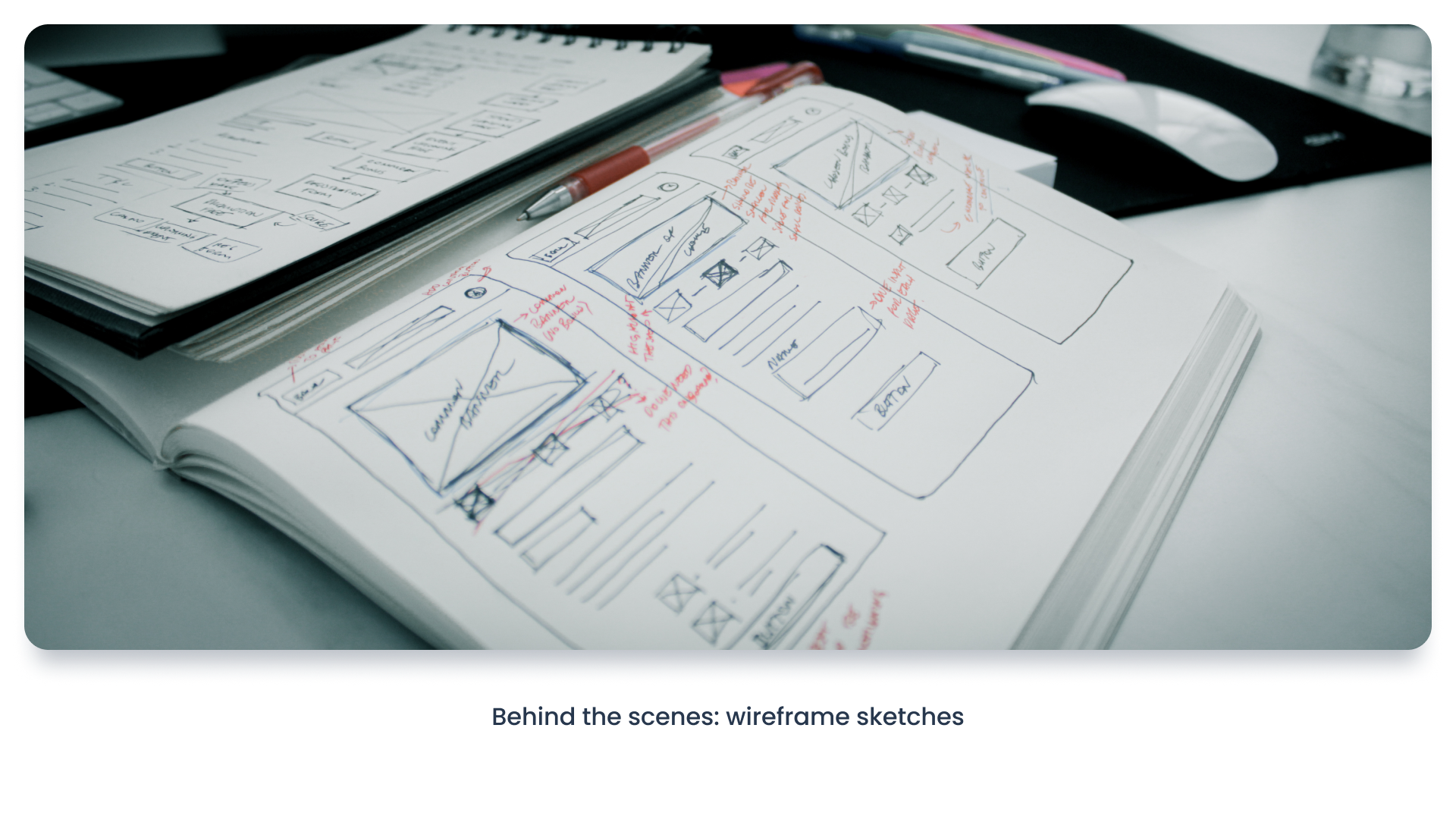
User flows
I made some adjustments to the existing forms' user flow to achieve our goals for the project.
Design
Style guide
I developed a detailed style guide to synchronise two different teams responsible for the desktop and mobile website to ensure that the product's design remained consistent across different devices.
High-fidelity mockups
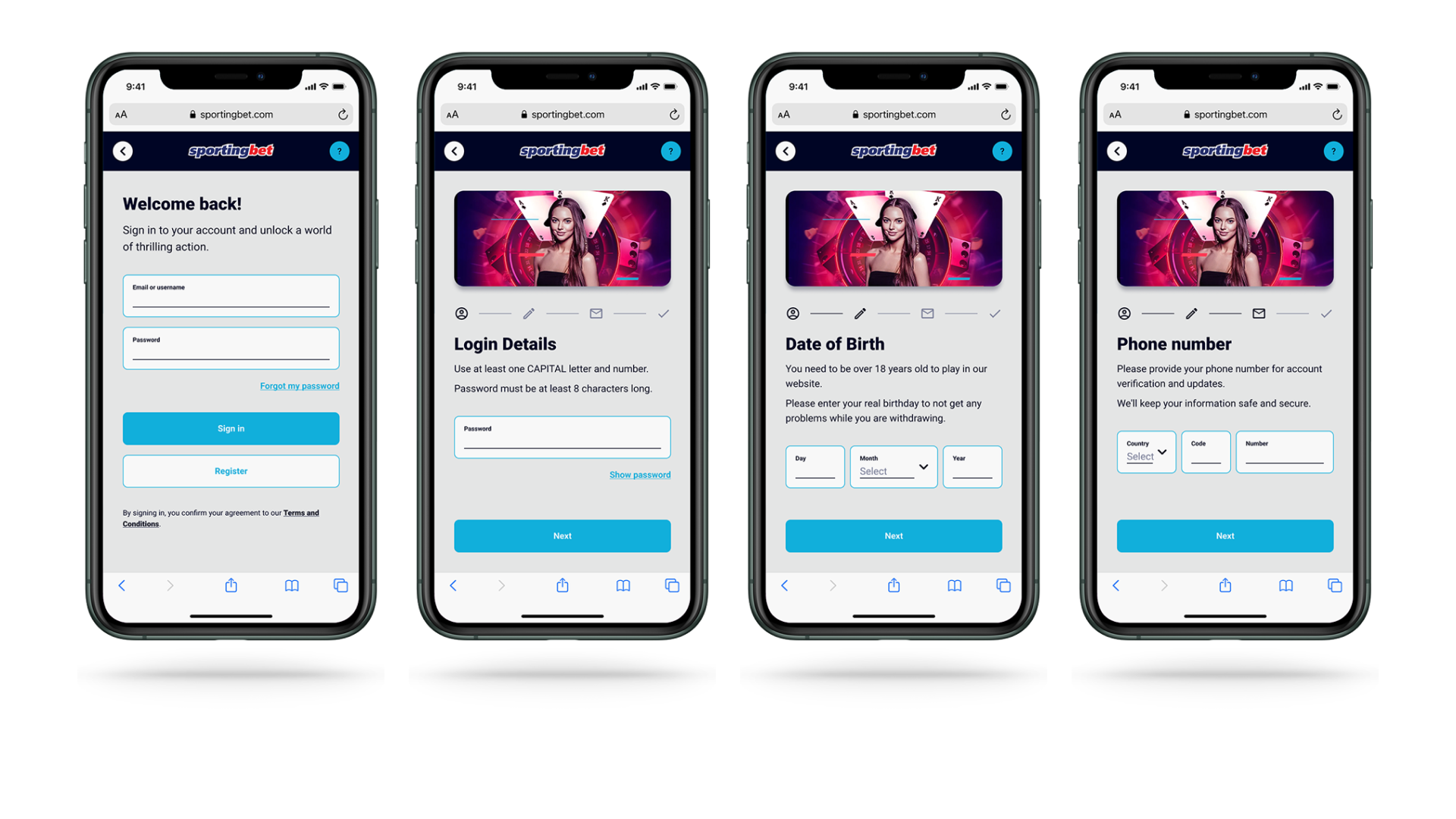
Finally, I created high-fidelity mockups that showcased the new registration flow and its benefits to the user. The new design improved the overall user experience, simplifying the registration process and guiding users smoothly towards the deposit flow, resulting in increased sign-ups and user engagement.
Results
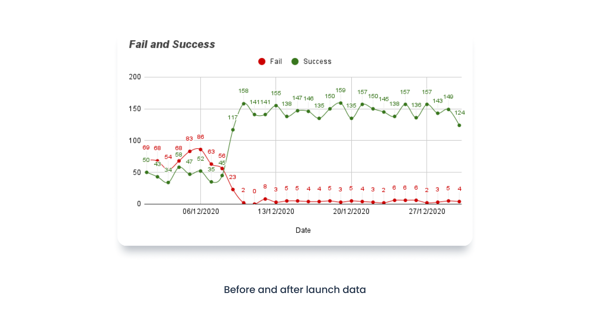
Within just two weeks of launching, we observed significant improvements. Conversion rates increased with the support of parallel marketing activities. Drop-off rates decreased to less than 5%, a remarkable improvement from the previous over 50%.